The Power of Widgets: Enhancing Your iOS App Experience
As a mobile app developer, you're always looking for ways to improve user engagement and enhance the user experience. One way to do that is by adding a widget to your iOS app. Widgets provide users with quick access to important information or functionality right from their home screen, without the need to open the app itself.
In this post, we'll guide you through the process of adding a widget to your iOS app. Whether you're a seasoned developer or just starting, we'll cover everything you need to know, from choosing the right widget type to implementing it in your app. By the end of this post, you'll be able to add a widget to your iOS app and take your user experience to the next level. So let's dive in!
Add a Widget Extension
To add a widget to your iOS app, you first need to create a widget extension. A widget extension is a separate target in your Xcode project that provides the code and resources needed to display the widget on the user's home screen.
To create a widget extension, open your Xcode project and go to File > New > Target. In the template chooser, select Widget Extension and click Next.

Xcode will create a new target for your widget extension and add it to your project. It will also create a default widget implementation, which you can customize later.
Creating a Widget
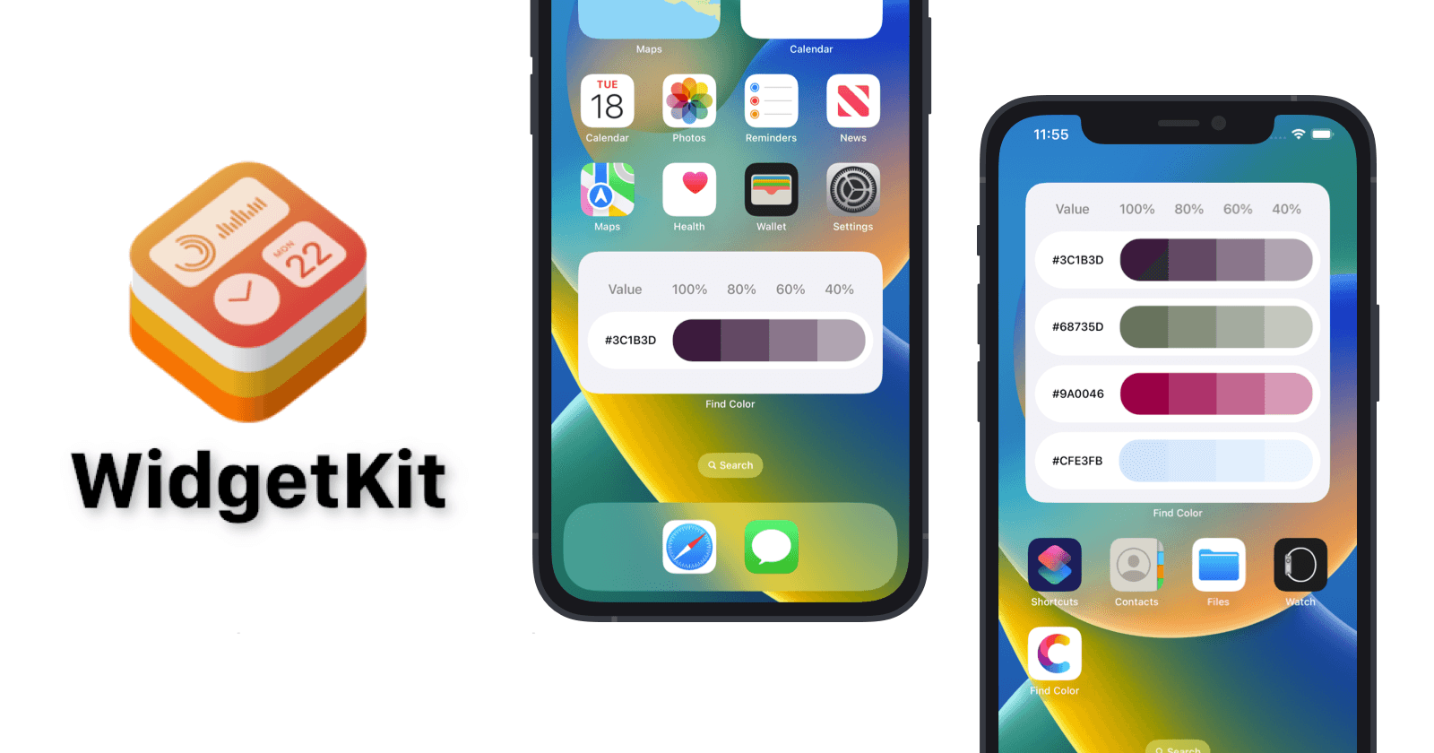
Now that you have created a widget extension for your iOS app, it's time to create the widget itself. In our case, we want to create a color list widget that displays a list of saved colors to the user

A widget consist of 4 main components:
The Timeline Entry
The Widget View (SwiftUI View)
The Timeline Provider
The Widget Configuration
The Timeline Entry:
The Timeline Entry component in WidgetKit is responsible for defining the data that will be displayed in a widget. It conforms to the TimelineEntry protocol and encapsulates the information about the date and content that will be displayed in a widget.
struct SimpleEntry: TimelineEntry {
    let date: Date
    let colors: [Color]

    static func capturedColors() -> [Color] {
        guard let data = UserDefaults(suiteName: SuiteName)?.object(forKey: ColorsKey) as? Data else {
            return [Color]()
        }
        do {
            guard let colors = try NSKeyedUnarchiver.unarchiveTopLevelObjectWithData(data) as? [UIColor]  else {
                return [Color]()
            }
            return colors.map { Color($0) }
        }catch {
            return [Color]()
        }
    }
}
In the code snippet provided, the SimpleEntry struct represents the timeline entry for the widget. It contains two properties: date which is a Date object representing the time when the entry was created, and colors which is an array of Color objects representing the colors to be displayed in the widget.
The capturedColors method is a static method that is used to retrieve the colors from the user defaults, which is stored using the NSKeyedUnarchiver and NSKeyedArchiver classes. This method returns an array of Color objects.
The Timeline Provider
The timeline provider provides information to the system about what is to be shown on the widget at a specific timestamp. As you might have expected, the timeline provider must conform to the TimelineProvider protocol and it consists of three components: the placeholder, the snapshot, and the timeline itself.
The placeholder function returns a SimpleEntry object with the current date and the default colors. This placeholder is displayed while the widget is being configured.
 func placeholder(in context: Context) -> SimpleEntry {
        SimpleEntry(date: Date(), colors: DefaultColors)
    }
The getSnapshot function is used to generate a preview of the widget in the widget gallery. It takes a context and a completion handler as parameters and returns a SimpleEntry object with the current date and the default colors.
   func getSnapshot(in context: Context, completion: @escaping (SimpleEntry) -> ()) {
        let entry = SimpleEntry(date: Date(), colors: DefaultColors)
        completion(entry)
    }
The getTimeline function is responsible for generating the timeline entries for the widget. It creates an array of SimpleEntry objects with the captured colors for each hour in the next five hours, starting from the current date. It then creates a Timeline object with the array of entries and a policy of .atEnd indicating that the timeline is complete. Finally, it calls the completion closure with the generated Timeline.
 func getTimeline(in context: Context, completion: @escaping (Timeline<Entry>) -> ()) {
        var entries: [SimpleEntry] = []

        // Generate a timeline consisting of five entries an hour apart, starting from the current date.
        let currentDate = Date()
        for hourOffset in 0 ..< 5 {
            let entryDate = Calendar.current.date(byAdding: .hour, value: hourOffset, to: currentDate)!
            let entry = SimpleEntry(date: entryDate, colors: SimpleEntry.capturedColors())
            entries.append(entry)
        }

        let timeline = Timeline(entries: entries, policy: .atEnd)
        completion(timeline)
    }
In summary, the Provider struct implements the TimelineProvider protocol and provides the timeline entries for the widget. The placeholder and getSnapshot functions are used to generate a preview of the widget and a placeholder while the widget is being configured, respectively. The getTimeline function generates the actual timeline entries for the widget.
The Widget View (SwiftUI View):
The widget view is responsible for displaying the widget's content, and it is implemented as a SwiftUI view. The PickerWidgetEntryView struct is a view that takes in an entry of type Provider.Entry, which is the same as the SimpleEntry struct we defined earlier. The @Environment(\.widgetFamily) var family property is used to determine the widget's family size, and the @ViewBuilder property is used to build the widget view's content based on its family size.
struct PickerWidgetEntryView : View {
    @Environment(\.widgetFamily) var family
    var entry: Provider.Entry

    @ViewBuilder
    var body: some View {
        switch family {
        case .systemMedium:
            VStack(spacing: CGFloat(10).dp) {
                TitleView()
                ForEach(entry.colors.prefix(1), id: \.self) { colorItem in
                    ColorView(color: colorItem)
                        .frame(height: CGFloat(60).dp)
                }
            }
            .padding(CGFloat(10).dp)
        case .systemLarge:
            VStack(spacing: CGFloat(10).dp) {
                TitleView()
                ForEach(entry.colors.prefix(4), id: \.self) { colorItem in
                    ColorView(color: colorItem)
                        .frame(height: CGFloat(60).dp)
                }
            }
            .padding(CGFloat(10).dp)
        default:
            Text("Some other WidgetFamily in the future.")
        }
    }
}
The Widget Configuration
The Widget Configuration is the main component of the widget and is responsible for setting up the widget's properties and behavior. In this case, we have a @main attribute that defines the PickerWidget struct as the entry point to the widget.
@main
struct PickerWidget: Widget {
    let kind: String = "PickerWidget"

    var body: some WidgetConfiguration {
        StaticConfiguration(kind: kind, provider: Provider()) { entry in
            PickerWidgetEntryView(entry: entry)
        }
        .configurationDisplayName("Captured Colors")
        .description("Get an overview of the last captured colors")
        .supportedFamilies([
                    .systemMedium,
                    .systemLarge,
                ])
    }
}
The PickerWidget struct conforms to the Widget protocol, which requires the kind property to be set to a unique identifier for the widget. This identifier is used by the system to differentiate between different widgets of the same type.
The body property of the WidgetConfiguration returns a StaticConfiguration object that defines the widget's behavior and content. In this case, it specifies that the widget uses a Provider object to provide timeline entries and a PickerWidgetEntryView object to display the content for each entry.
The configurationDisplayName property sets the display name of the widget in the widget configuration screen. The description property sets the description of the widget, which is also displayed in the widget configuration screen.
Finally, the supportedFamilies property sets the list of widget families that this widget supports. In this case, the widget is supported by the .systemMedium and .systemLarge families.
Overall, the PickerWidget struct defines the widget's behavior and content, and the body property sets up the widget configuration, including the provider, view, display name, and description.
conclusion
In conclusion, creating a widget is a straightforward process that involves several components. We have seen how to create a widget configuration, a timeline entry, and a widget view using SwiftUI. By following the steps outlined in this post, you can create a custom widget that provides users with a quick and convenient way to access information from your app. Widgets are an excellent way to enhance the user experience and provide a unique way for users to interact with your app, and we encourage you to explore the different possibilities that widgets offer.
